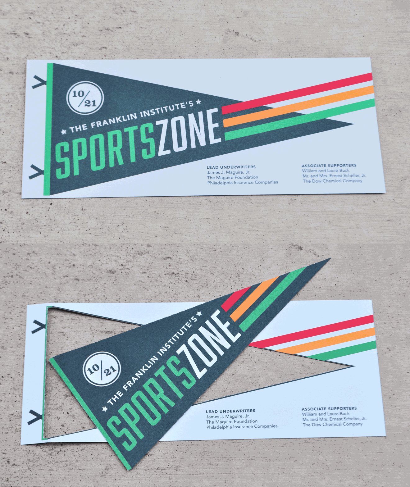
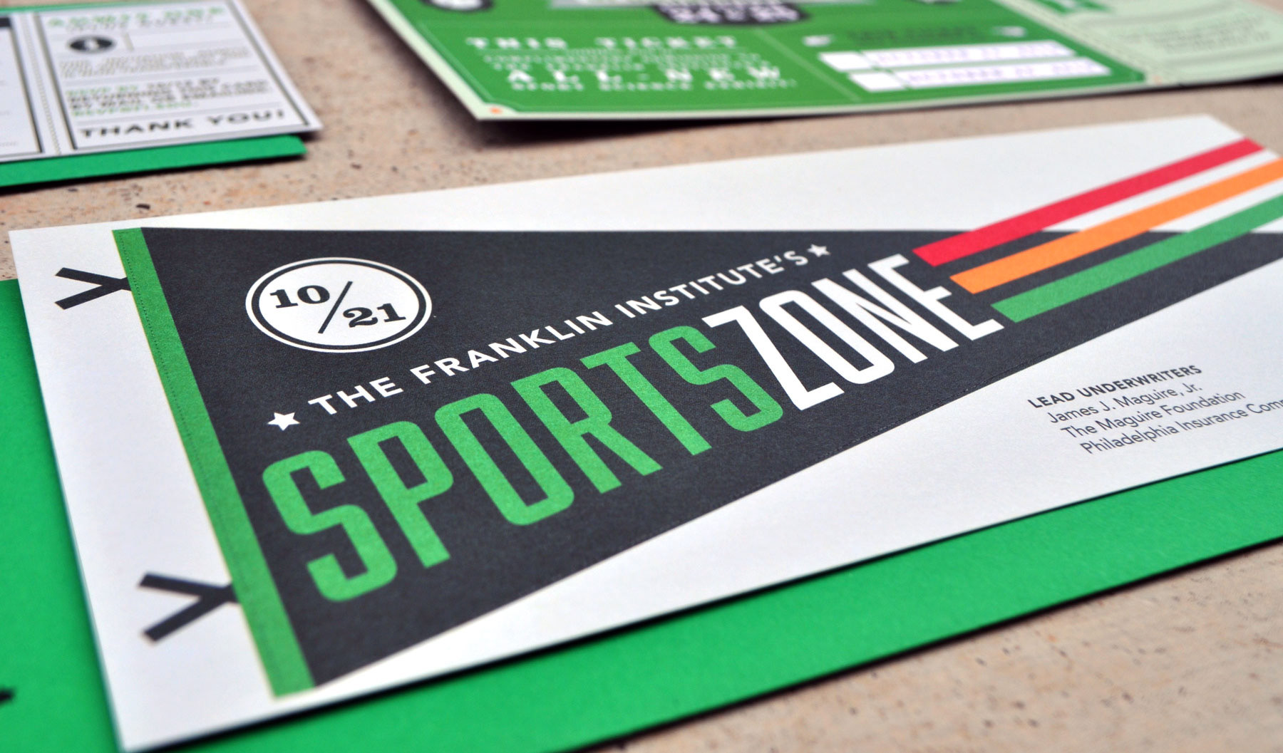
EXHIBIT FOR THE FRANKLIN INSTITUTE, 2016
project overview
For this project I art directed and designed SportsZone, The Franklin Institute's permanent exhibit about the science of sports. The project included working with a team to conceptualize the content strategy. From there, I developed the design strategy and produced all exhibit graphics, as well as marketing and brand materials. The process also involved contracting and art directing photographers, illustrators, fabricators, and animators.
For this project I art directed and designed SportsZone, The Franklin Institute's permanent exhibit about the science of sports. The project included working with a team to conceptualize the content strategy. From there, I developed the design strategy and produced all exhibit graphics, as well as marketing and brand materials. The process also involved contracting and art directing photographers, illustrators, fabricators, and animators.
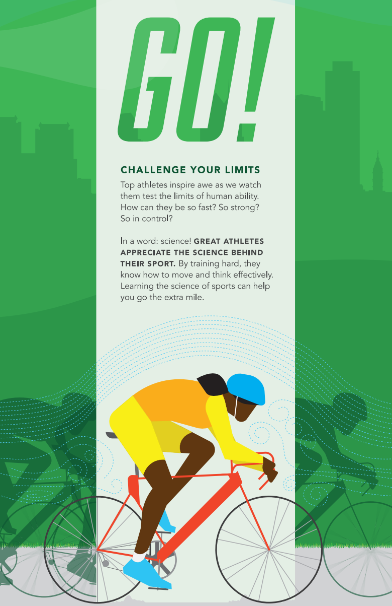
Content panel for the "GO!" exhibit section.
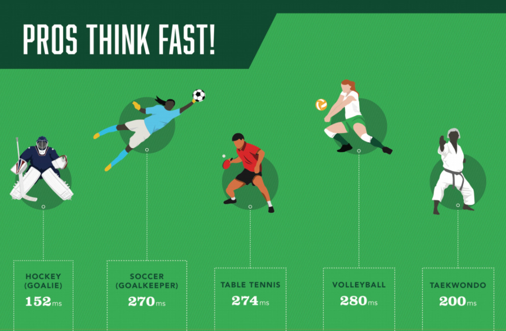
Sample content panel for the table tennis interactive, where visitors can test their reflexes.

Sample "pro tip" content panel.
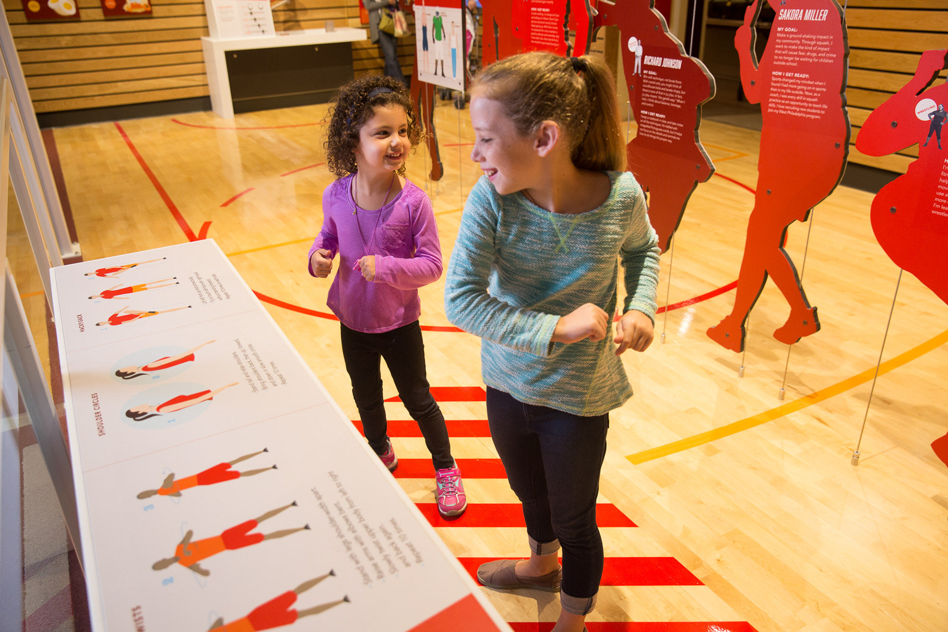
Young visitors interactive with the "warm up" content panel.
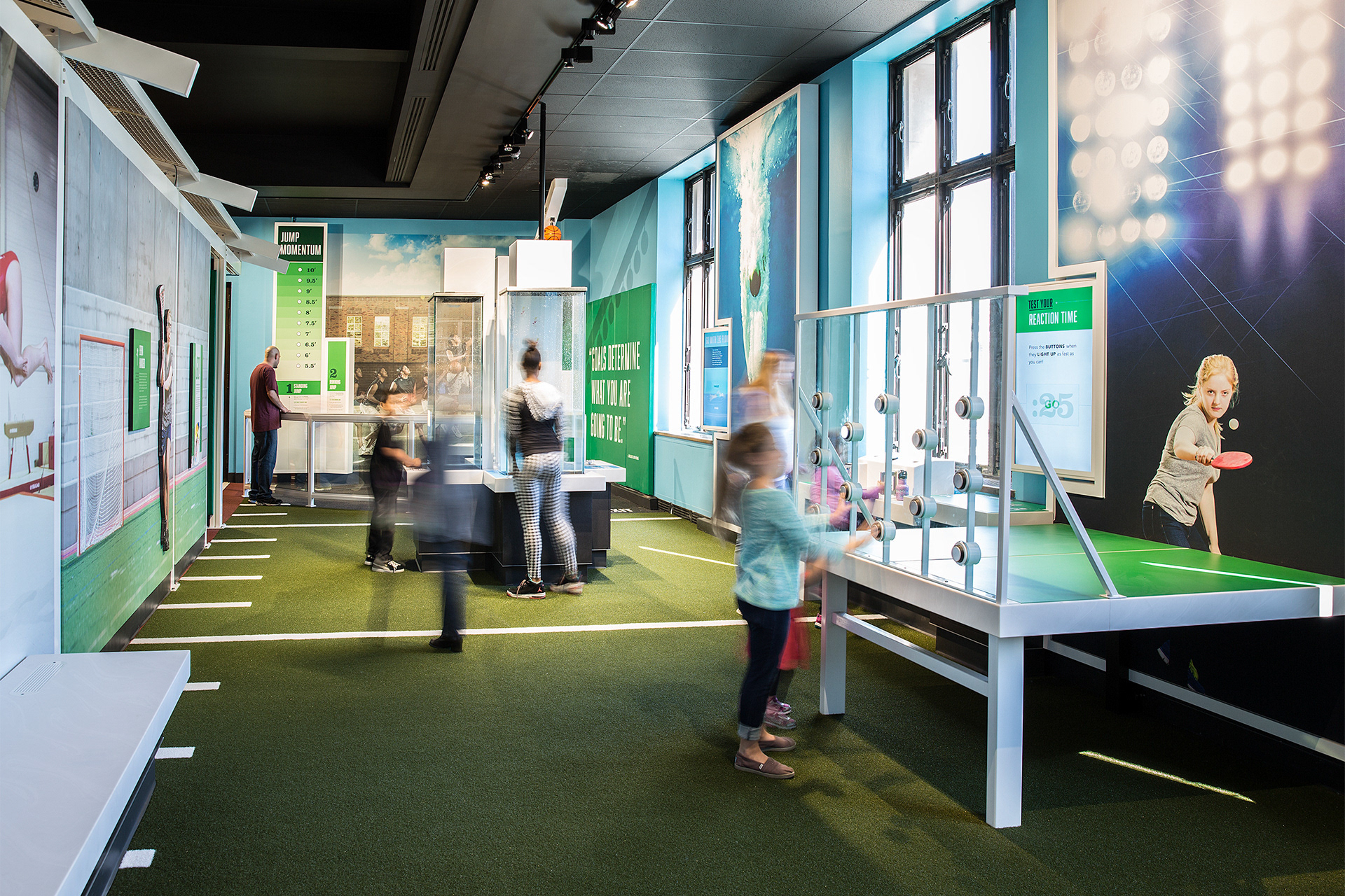
Visitors playing in the "GO!" section of the exhibition.
CONTENT STRATEGY
The exhibit's mission was to inspire visitors to discover how sports connects the science of the human body, laws of motion, and technical innovation.
Through my initial design sketches, I realized using traditional (static) content panels would not work for this exhibit. The science concepts were too dense and the subject matter needed activation. In order to make engaging, and easy-to-understand interpretative panels, I worked with local animators (ReMade) to build five looping animated panels.
DESIGN STRATEGY
As a kid, I struggled with both science and sports. So, I knew I was going to be this exhibit's toughest critic. My personal mission for this exhibit was to make an exhibit that kids, like 12 year-old me, would enjoy. That meant ensuring that this was a space for inclusivity and representation. I made a point to ensure that every photograph and illustration used in the exhibit considered diversity of race, gender, body, and ability.
I had the same credential when it came to developing the marketing materials. I wanted to make sure that when this exhibit was advertised on billboards, taxi cabs, and on TV screens it accurately represented the demographic of Philadelphia. Sending the message that no matter your age, gender, or race, you deserve the opportunity to be part of the team.
